The Curve: Here’s A Graphical Look At COVID-19 In Escambia County
April 27, 2020
Here is a graphical look at COVID-19 by the numbers in Escambia County.
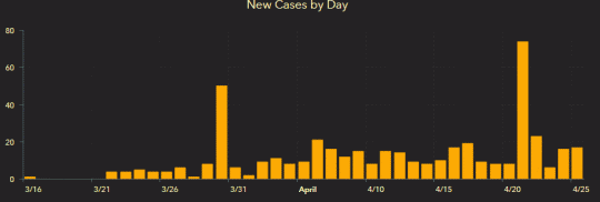
Below: Escambia County cases per day, Florida residents and non residents
Below: Escambia County cases per day, residents only
Data source: Florida Department of Health as of 4/26.
Comments
15 Responses to “The Curve: Here’s A Graphical Look At COVID-19 In Escambia County”



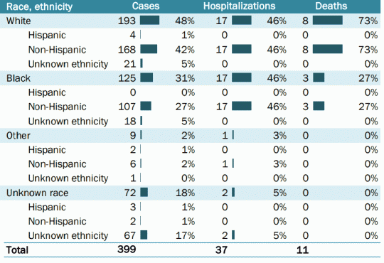
People are ridiculous. The Pensacola Metro area has over half a million people with barely 600 cases. Most of those in jails, prisons, and Nursing Homes. It isn’t because we’re “shut down” Have any of you been working ? I have. I travel. I can’t tell the difference in traffic. This is insane. Do you people even research the information your fed ? Do you research the source of it ? What kind of person, organization, etc. No wonder liberals control every power structure in America. They are smart and have invested in learning how to indoctrinate the masses.
KJ why cant people grasp the concept that if you don’t feel its safe to leave your home then don’t go anywhere. Some people need to get back to work to feed their families, pay mortgages and not lose everything they have worked their whole lives for.
Regardless of the number of tests, the top graph shows the number of cases for about the past 35 days. The most recent bar (April 25) is still higher than about 25 of those days. So, this graph shows we are nowhere near a “low” point yet. There were a few really high days, but that’s why the experts look at trends, not just one random day. Until there is a lot more testing, we just don’t have the information we need. I find it frightening that our country has been left so vulnerable. No excuses.
People who want to reopen don’t seem to grasp this isn’t a hurricane. It’s not gone. It’s not spreading because everything is closed. Once everything open back up it will spread. Why is this concept so hard to grasp?
REGARDING:
“we’re not getting hit anywhere NEAR as bad as they claimed we would.
Reopen Pensacola.”
We took the precautions they said were needed to keep things from becoming as bad as they feared they would if we didn’t take those precautions. Things DID get bad until we took those precautions and for a while afterward as the recently exposed got sick but exposed fewer people. Either taking the advice of the experts, the educated people, helped or it was sheer coincidence.
On the other hand, we are closer to having the tests and equipment we were falsely told we had plenty of back in February and we know at least some of the snake oil not to pin our lives on (especially since it seems to have killed some who would have lived had they not taken hydroxychloroquine) and we are closer to finding out what might help. Maybe with improved supplies and knowledge — including who we can and can’t trust, we can mostly survive opening up better.
David for better days
(and avoiding internal disinfectants)
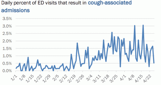
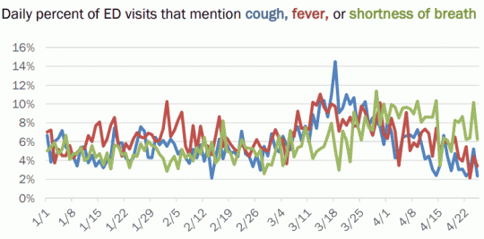
The best graphic on this page is the ED visits and admissions. Although this does not mean that all of these symptoms were Covid-19 related, it does give a good indication of when the symptoms spiked. It would be even better if we knew the average number of ED visits a day so we could better interpret the percentages. However, if fewer people are going to the ED out of fear, then that could skew the numbers lower.
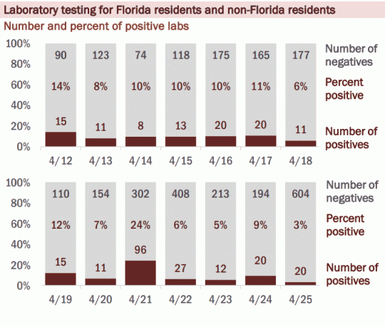
The testing graphics indicate a spike, but the information has to be analyzed carefully to get the whole story. You will notice that the numbers go up when the number of tests processed go up. If it was a true spike the number of positive cases would go up even if the processed test numbers stayed the same.
I am all for protecting our community, but statistics must always be taken with careful analysis. Numbers are not usually as cut and dried as one might think.
What do people like me do ? I am fully disabled and have been awaiting broader medical care not necessarily related to COVID-19. My immunity is compromised and I am awaiting services related to my care. What do those of us who are at higher risk of severe and potentially fatal consequences ? Who speaks for us ? Who will help those of us who maybe cannot speak, or were already disabled and awaiting care. I don’t feel safe leaving my home. How do we know when it is safe ?
I am not just trying to add a tough question, I honestly need to know ?
Thank you for your coverage.
The high spike from Easter weekend looks like. Take precautions…let’s get rid of this thing
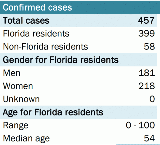
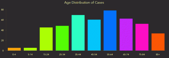
>Can ages be added on as well as known underlying conditions?
Ages are right there in a graph above. FDOH is not provided data by county on underlying conditions.
Can ages be added on as well as known underlying conditions?
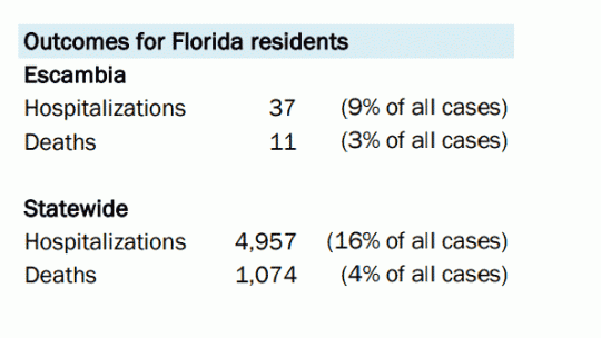
Looks like Escambia isn’t doing too bad at all. Looks like to me, we’re not getting hit anywhere NEAR as bad as they claimed we would.
Reopen Pensacola.
Thank you for doing this!
No real curve or plateau I see…..could be number of visitors?
Great graphics., thank you.
A spike after 4-20 when they warned about it making you more susceptible…